Creating a pinch using CSS
Styling that we would typically use background images for can be done using CSS. This post explains how to create a 'pinch'.
Demo: CSS pinch
##Every little helps
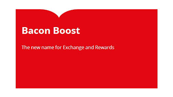
I was browsing the Tesco Clubcard website after they recently re-branded it. I quite liked the sections they used with a little pinch at the top.

Keen to see how it had been done, I opened my browser dev tools to find out it was an image, and so was the headline and sub line text. I think we can create something similar without having to resort to an image.
##Our shopping basket
To create this we're going to need the following CSS properties:
border-radius:before:afterpseudo elements
##Markup
Ok let's create some semantic markup. The advantage of not using an image is that we now have meaningful content in our markup, a real benefit to screen readers.
<section class="pinch">
	<h1>Bacon Boost</h1>
	<p>The new name for Exchange and Rewards</p>
</section>
Here we're using section to define this part of the content. According to the spec a section is defined as follows.
The section element represents a generic section of a document or application. A section, in this context, is a thematic grouping of content, typically with a heading.
##Style me up
That's all we need in terms of markup, the rest is CSS. The main trick to this is using border-radius to create two arcs which we will then position to form the pinch. This idea was based on pure CSS speech bubbles by Nicholas Gallagher.
We will use border-top-left-radius and border-top-right-radius to create our arcs.
border-top-left-radius: 70% 100%
border-top-right-radius: 70% 100%
We can target each corner separately and specify horizontal radius and vertical radius. This allows us to manipulate the shape of the arc to something like this.
If you want to go into more detail about how border-radius works I would recommend watching this great talk on the humble border-radius by Lea Verou.
###Pseudo chop
Historically we would have to add div or span elements to our markup for creating our arcs. Now thanks to :before and :after pseudo elements we do not have to muddy our markup to achieve this.
Firstly we need to create a rectangle of the colour we want the gap created by our pinch to be.
.pinch:before
{
	content: "";
	position: absolute;
	top: 0;
	left: 17%;
	width: 128px;
    height: 40px;
	background-color: #FFFFFF;
}
The main points here are an absolutely positioned element of a fixed size, with a background colour.
Now to add the arcs.
.pinch:after
{
	content: "";
	position: absolute;
	top: 0;
	left: 30%;
	width: 100px;
    height: 40px;
    border-top-left-radius: 70% 100%;
    background-color: #E30613;
}

.pinch > :first-child:before
{
	content: "";
	position: absolute;
	top: 0;
	right: 69%;
	width: 100px;
    height: 40px;
    border-top-right-radius: 70% 100%;
    background-color: #E30613;
}
We use after and the first child element to create and position the arcs. It is important to note the ordering. Creating the rectangle first and then the arcs ensures the elements naturally layer themselves correctly over each other without the use of z-index.
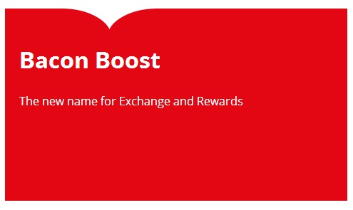
##Putting it all together
Our final markup and styles look like this.
<!DOCTYPE html>
<html>
<head>
	<title>CSS Pinch</title>
	<style>
		body{
			color: #FFFFFF;
			font-family: 'Open Sans', sans-serif;
		}

		section {
			background-color: #E30613;
			width: 460px;
			height: 270px;
			padding-left: 20px;
		}

		section h1{
			padding-top: 50px;
			font-size: 2rem;
		}

		.pinch
		{
		    position:relative;
		}

		.pinch:before
		{
			content: "";
			position: absolute;
			top: 0;
			left: 17%;
			width: 128px;
		    height: 40px;
			background-color: #FFFFFF;
		}

		.pinch:after
		{
			content: "";
			position: absolute;
			top: 0;
			left: 30%;
			width: 100px;
		    height: 40px;
		    border-top-left-radius: 70% 100%;
		    background-color: #E30613;
		}

		.pinch > :first-child:before
		{
			content: "";
			position: absolute;
			top: 0;
			right: 69%;
			width: 100px;
		    height: 40px;
		    border-top-right-radius: 70% 100%;
		    background-color: #E30613;
		}
	</style>
</head>
<body>
	<section class="pinch">
		<h1>Bacon Boost</h1>
		<p>The new name for Exchange and Rewards
	</section>
</body>
</html>
And this is our result.